Bad analyses typically don’t come from bad intentions.
More often than not, it starts with an analyst with a tight deadline and an impatient boss standing right behind them.
I’ve been a data analyst for over a decade. During that time, I’ve dealt with nightmare spreadsheets, inherited SQL queries that looked like ransom notes, and tried (often in vain) to explain to a VP why that chart “everyone liked” was, in fact, garbage.
Over time, I’ve come up with some rules to live by: my “10 Commandments for Data Analytics.”
To be clear: this isn’t a rant.
These are rules developed over my career from hard-earned lessons, real-world mistakes, weird meetings, and charts that aged like milk.
If you’ve ever looked at an analysis and asked “Wait… are we sure about this?”… this list is for you.
1. Thou Shalt Not Develop a Conclusion Beforehand
(Even if you’re pretty sure it’s depression.)
If you already know what story you want the data to tell, you’re not doing analysis.
You’re just running a confirmation bias roadshow.
Let the data lead you, not the other way around.
If the numbers say you’re wrong? Congrats, you’re one step closer to being a real analyst.
Confirmation bias is the urge to find data that agrees with you and conveniently ignore anything that doesn’t.
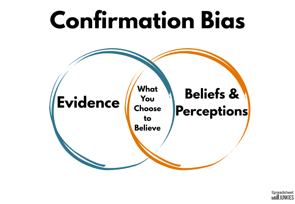
What does this look like in real life?
Maybe it’s Karen from Marketing who “just knows” a campaign worked, and wants you to pull a chart that proves it.
Maybe you’re subconsciously rooting for a hypothesis because you spent two days building a dashboard around it.
But it doesn’t happen only to data analysts and marketers.
In a landmark 2011 study, Rosmarie Mendel (et al) studied 150 psychiatrists and medical students who were given a case summary that was written to strongly imply the patient suffered from depression.
The thing is…that was wrong.
The correct diagnosis, if you looked at all the data, was Alzheimer’s disease.
Still, 30% of those studied stuck with that initial diagnosis, despite having access to additional information should have pointed them in another direction.
Now, imagine this is a marketing campaign, customer data, sales trend, or user churn.
The same principle applies: If you only look for proof you’re right, you’ll probably be wrong.
Key takeaway: If the data looks strange, don’t bulldoze through it.
Be curious.
Be skeptical (especially of yourself.)
Ask why.
Ask again.
If someone hands you a story and asks, “Can you come up with numbers to back this up?” … congratulations, you just became the adult in the room.
2. Thou Shalt Not Manipulate the Y-axis to Exaggerate the Truth
(Especially not with one real line and one fake one.)
There are two parts to this commandment, each is equally as deceptive. They’re also the easiest to avoid.
One of the oldest tricks in the book is altering the range of the Y-axis range until a tiny change looks like a vertical cliff dive.
A graph that shows the rate jumping from 4.0% to 4.2% might look like a massive spike if the Y-axis starts at 3.9%.
In context, it’s just statistical noise.
Even when the numbers are real, the impact is distorted.
Humans are wired to interpret visual height as magnitude. So when you chop off the baseline, you’re not just tweaking a chart. You’re changing someone’s perception of reality.
You see this most often in political ads, stock pitches, marketing dashboards, anywhere someone wants to push a narrative without technically lying.
Key takeaway: if your insight only looks dramatic after squeezing the axis, maybe it’s not that dramatic.
Arguably just as bad is when analysts plot multiple things on the same graph that don’t belong together and then act shocked when they diverge.
In early 2024, activist Joshua Potash posted a video claiming rent had skyrocketed far beyond income since 1985.
It went viral.
It was also complete B.S.
Yes, this came from a large public dataset from the US Department of Housing and Urban Development (HUD) and the U.S. Census Bureau.
But only part of the data was adjusted for inflation.
It mixed real and nominal data to manufacture outrage.
And it worked.
The chart racked up 77,000 likes and 17,000 reposts before a Community Note quietly pointed out the error.
Economist Noah Smith did the math using actual inflation-adjusted numbers from the Federal Reserve (FRED). He found that when you compare both rent and income adjusted and indexed to 1985, they rise almost in lockstep.
There was no runaway divergence.
In fact, personal income outpaced rent over the long term.
Key takeaway: Always check what units you’re comparing.
A misleading Y-axis or unmatched scaling can turn valid data into pure fiction.
Or worse…propaganda.
3) Thou Shalt Not “Lie With Data”
(Even if the numbers are technically true.)
Let’s define “lying with data” as implying things that are technically true, but not what the reader assumes when reading your analyses.
Stop me if you’ve heard this one:
“You need to tell the right story with the data.”
“Frame it to make us look good.”
This could be changing the headline, adjusting the axis, or highlighting part of the graph and hoping no one asks about the rest.
Pretty soon you’ve told a perfectly misleading story using perfectly accurate data.
We saw this a lot during 2020.
No matter what issue it was, or what side of the issue you were on, there was someone using data to prove their point.
The trouble is, that same data often proved the opposite point as well.
It just depended on the perspective.
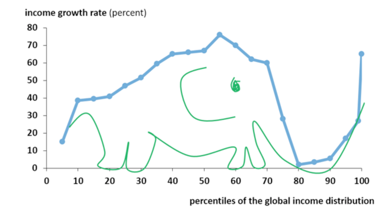
One of the most famous examples is the Elephant Graph.
This legendary chart was created by economist Branko Milanović and shows global income growth by percentile from 1988 to 2008.
It gets its name because the chart looks suspiciously like an elephant: a big hump in the middle, a dip around the knees, and a rising trunk at the end.
Here’s what it shows:
- The global middle class (largely in China, India, and other emerging economies) saw massive income growth.
- The 80th–90th percentile (the working class in developed nations) saw stagnant or declining real income.
- The top 1%? They got even richer. Shocking, I know.
But here’s where things get messy:
- The pro-globalization crowd will point to the hump and say, “Look! Global poverty is plummeting. Success!”
- The anti-globalization crowd will focus on the dip and say, “See? The middle class got crushed.”
Same graph.
Same data.
Completely different stories … and they’re both true.
Key takeaway: As analysts, our job isn’t just to show the data. We contextualize it.
Every chart tells a story—but if you only tell the part that supports your argument, you’re not analyzing.
You’re spinning.
And honestly, we already have enough of that on cable news.
4) Thou Shalt Not Cherry-Pick Dates to Make Yourself Look Good
(Especially if your stock is still down 40%.)
Want to make something look like a comeback story?
Simple.
Start the chart at the bottom and hope no one scrolls back too far.
Take this MarketWatch headline from December 2024:
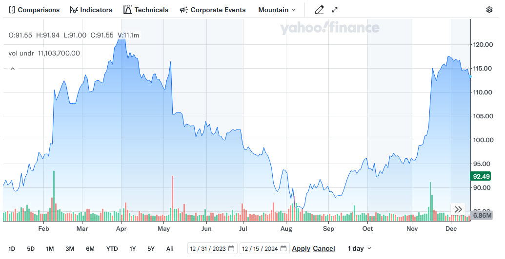
“How Disney’s stock can book even more gains after its best year since 2020.”
Sounds like Mickey’s back, baby!
The stock had jumped from $90 to $113.34—a 26% gain in 2024.
But don’t start celebrating yet.
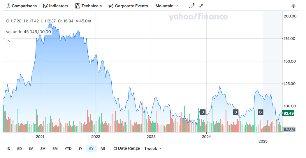
That headline conveniently starts the clock on January 1, 2024, ignoring the fact that Disney’s all-time high was $197 in March 2021.
When you expand the time horizon, that 26% gain turns into a 41% drop from the peak.
This kind of selective reporting is common in finance.
CEOs do it regularly on earnings calls. Investment firms do it when pushing their mutual funds over their competitors.
And yes, financial media does it too.
Headlines like “Best Year Since 2020” gets clicks. “Still Down 40%?”… not so much.
Key takeaway: Here’s your job as an analyst: Look at different timeframes. If the starting point is suspiciously convenient, assume there’s a mess hiding just off-screen.
When analyzing trendlines, you can usually find the truth lurking in the years they didn’t show you.
5) Thou Shalt Use a Large Enough Sample Size
(Because your friend group isn’t statistically significant.)
In 2015, journalist John Bohannon pulled off one of the most delicious data stings in history.
Literally.
He ran a real study that “proved” that eating dark chocolate helps you lose weight.
Media outlets worldwide gobbled it up.
Headlines everywhere screamed, “Science Says: Chocolate Helps Burn Fat!”
But nobody stopped to ask the most important question:
How big was the sample?
15 people.
That’s it.

Worse yet, the study was tracking 18 variables.
Statistically speaking, that’s as bad as flipping a coin 3 times and claiming it’s weighted because you got two heads.
The results were technically true, but they’re still lying with data. (See Commandment #3 for more).
One of the 18 measured outcomes happened to show statistical significance, yes.
However, with enough variables and a small enough group, you’re practically guaranteed to find something.
But if you only report that one result without adding context, then you’ve created a viral news story and a diet fad built on noise.
Small sample sizes are highly sensitive to random variations. The fewer people you include, the more likely your “trend” is just a fluke.
And if your sample isn’t representative (for example, a handful of bored volunteers looking to drop a few pounds for summer), then you shouldn’t generalize your results to anyone else.
Key takeaway: If your sample size is tiny and your results are huge, the math isn’t magic. It’s marketing.
6) Thou Shalt Acknowledge Biases in Your Samples
(And no, “funded by industry” doesn’t mean “neutral.”)
If your data was collected by someone with something to gain, say so.
If your research was paid for by a company selling a product, say so.
And if you’re using biased samples, but pretending they represent the average person, just stop.
You’re not analyzing.
You’re selling.

Coca-Cola:
For years, Coke quietly funded studies suggesting the main cause of obesity was a lack of exercise – not sugary drinks.
Their money-backed researchers, funded wellness programs, and even created an entire nonprofit: the Global Energy Balance Network. All while conveniently ignoring decades of research linking sugar consumption to metabolic disease.
The wasn’t flawed, but the agenda behind it was.
The tobacco industry:
For decades, they funded studies to downplay the link between smoking and cancer.
They wanted to create just enough doubt to delay regulation long enough to keep selling cigarettes. Entire generations suffered because corporations bought themselves “data-backed studies.”
Opioids:
Purdue Pharma funded and promoted research that claimed prescription opioids had a “low risk of addiction.”
They cited a one-paragraph letter in The New England Journal of Medicine so aggressively, and so out of context, that it helped fuel a full-blown epidemic.
Even worse…that letter wasn’t even a study.
Bias doesn’t mean the numbers are fake. But it does mean the questions, the methods, and the framing probably were.
Pretending otherwise isn’t just unethical. It’s dangerous.
Key takeaway: If your data is backed by someone with skin in the game, disclose it.
7) Thou Shalt Highlight Data That Actually Matters
(Not just the numbers that make your dashboard look pretty.)
Ever seen a report packed with pie charts, color-coded bars, and trendlines… that tell you absolutely nothing?
That’s what happens when analysts confuse data volume with data value.
Not all metrics deserve screen time.
The real skill in analytics isn’t collecting data. It’s knowing which data matters and why.
Here are some popular vanity metrics:
- “Pageviews” that don’t reflect engagement
- “Open rates” without context
- “Follower growth” with no tie to conversion
- Dashboards with multiple KPIs and flashy visualizations (i.e. every tile is a different chart, color, or speedometer)
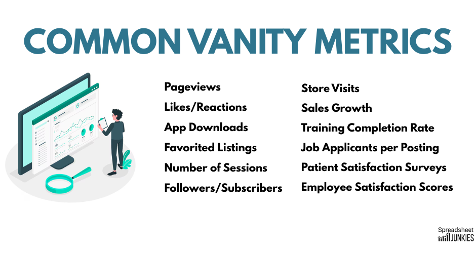
These sound impressive in a slide deck or marketing one-pager.
But they’re not providing any insight.
Our job as an analyst is to highlight the numbers that drive decisions, not to show every number available.
If the Sales team can’t act on it, or leadership can’t do something with it, why is it on slide three?
Key takeaway: If you took the chart out of the report, would anyone notice? If so, leave it out to begin with.
8) Thou Shalt Not Use 3D Charts
(Unless it’s a middle-school science fair.)
If there’s one feature I can’t stand in Excel, it’s 3D Charts.
IMO, they’re optical illusions disguised as business intelligence. They’re flashy, deliberately confusing, and distort your visualization’s story.
But just because a feature exists, doesn’t mean you should use it.
In his article “Why 3D Charts Are a Terrible Idea,” Praveen Purohit explains why our brains just aren’t built to interpret these things correctly.
It comes down to occlusion and perspective distortion.
Occlusion is when some data points block or obscure other data points.
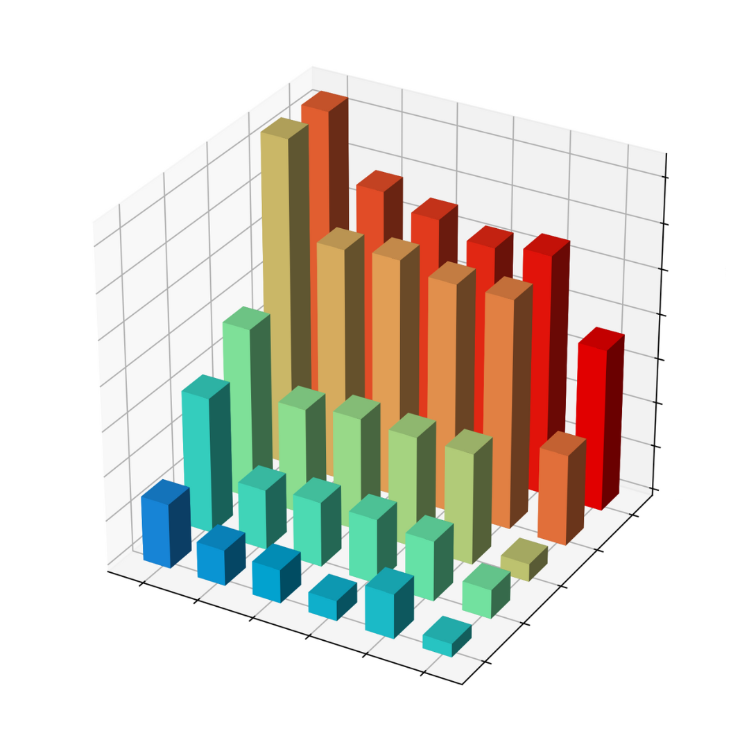
Hidden clues are fun in a suspense movie, but they have no place in your quarterly reports.
Perspective distortion is when objects farther away appear smaller, even if they’re not.
That bar at the back? It might be the same height as the one up front, but it looks way smaller. And that pie chart slice that’s tilting toward the viewer appears 10% fatter than it actually is.
Your brain knows this, so it tries to “correct” for the distortion. The trouble is that it sometimes ends up making incorrect assumptions.
Some professional tools, like Tableau, don’t even support 3D charts because they’re built for clarity, not gimmicks.
Key takeaway: If your chart needs gimmicks to get attention, your data’s probably not that interesting to begin with.
9) Thou Shalt Not Use Loaded Survey Questions
(Yes, even the awkward ones.)
Surveys look simple: Ask a question. Get an answer.
But badly worded questions are the analytics equivalent of planting evidence at a crime scene.
You’ll see this most often in marketing and politics.
A stakeholder wants “customer feedback” and hands you a survey that reads more like a push poll:
“How much do you love our new feature?”
What if I don’t?
Leading questions are phrased to quietly whisper the “right” answer into your ear.
Then there are double-barreled questions:
“How satisfied are you with our product’s performance and user interface?”
Those are two separate questions, but companies mash them into one to dilute negative responses so they can pretend the results mean something.
Finally, double negatives:
“Do you disagree that the following question isn’t confusing?”
Wait, what?
Your survey is only as good as the questions you ask, and how honestly you report them.
If you only report the cleaned-up responses without sharing the mess behind the curtain, you’re not analyzing feedback.
You’re writing fiction.
Key takeaway: If you need to twist a sentence to get the answer you want, maybe you don’t want the truth in the first place.
10. Thou Shalt Never Forget: Correlation ≠ Causation
(No matter how juicy the chart looks.)
This is the one they write on whiteboards, print on posters, and tattoo on the souls of first-year stats students.
Yet every day, this commandment is broken by people who should know better.
There’s a correlation between ice cream sales and shark attacks? Jaws must not like mint chocolate chip.
Coffee drinkers live longer? Must be the caffeine.
More Excel use leads to higher productivity? Okay, that one’s probably true, but show me the data first.
Finding a correlation is not the final step.
It’s the beginning.
It should make you ask, “Why?”, not shout “Got it!” from your desk.
It’s easy to forget this when your chart looks clean, your R² is high, and your manager wants a headline.
But remember: correlation is not causation.
It’s just a nudge to go deeper.
If you don’t go deeper, you’ll end up writing reports that say chocolate causes weight loss, soda isn’t that bad, and middle managers are responsible for climate change.
They aren’t…probably.
Worse: you’ll wind up making expensive, public, career-defining decisions based on vibes and pretty lines.
Key takeaway: This one stands on its own: correlation ≠ causation.
Final Thoughts
Here’s your final takeaway: Don’t confuse coincidence for insight. Question your conclusions.
Re-run your filters.
If you’re ever tempted to draw a straight line from A to B without understanding what’s in between, then flip back to Commandment #1.
Start over. Be better.
